Example of Play

Commentary on Games Design


Leave a comment

Dicelantis

In the words of the rightly forgotten post-grunge angst rockers ‘Staind’: it’s been a while.

What can I say? We’ve had stuff on. Unfortunately only some of it has been game design related. Having won the inaugural UK Games EXPO board game redesign competition in 2014 we are trying to get the winning game published with little success. Alongside this we had a bit of interest in a dice game we started designing years ago, all of which fell through too. It got a bit dispiriting, we got a bit busy with other stuff. We’ve mentioned before that Sam and I use Google Docs, Chat and Sites almost exclusively for our collaborations (board game design, fantasy fiction, collaborative fiction, surreal soap opera scripts- the usual) and we have thousands of words in there, much will never see the light of day. We decided this week that some of it should: we put up print and play rules for Dicelantis a push-your-luck take-that dice-chucker designed to be played in a pub.

Let me tell you what happened.

Design Diary: Dicelantis
DLsplash

It all started on my 36th birthday with this post by Travis from Indies Boards and Cards. The request was for a push your luck dice game using D6s and at most a score pad. It seems like a fair request but it’s tougher than it first appears, something I noted and Sam promptly ripped on me for because, make no mistake:
pic1377536

I love working with Sam. And anyway I only look a bit like that cat.

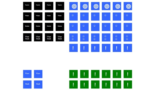
We decided to team up and send in a submission. The first concept was Maelstrom Dice, for which I whipped up these awesome dice face sticker templates:
Maelstrom dice

Lesson #1: Never, ever, let Matt do graphic design.

We got a GDoc set up for the rules and Sam promptly turned it into a refuse bin of ideas, rules, “Protips” (patronising strategy hints aimed at the criminally feckless- I think he’s worked them out of his system now) and a mini-review of another game. With judicious use of blank space, I sorted out a first set of rules and printed off a copy to take to The Jugged Hare in Victoria, home of the London PlayTest sessions organised ruthlessly with clipboards, timings and military precision by the wonderful Rob Harris.

Aside: PlayTest is singularly amazing. Go. Find one: attend.

Notes following playtesting on 01/07/12

  • too many sharks. Rolls of 3 sharks 3 survivors and a two waves led to no rerolls. Rolling 3 or 4 sharks is dispiriting. Mermaid seen as essential and white dice w/wave much liked as the game proceeds at a good rate.
  • so hard to claim a survivor that dice starting overflowing the cup.
  • too many icons. Point was made that King of Tokyo has 4 different icons to learn, and this has 10.
  • neptune does not do enough as the effect happens after pairing
  • key point: the game feels too prescriptive whilst it’s fair and the mechanics work there are too few decisions for the players to make. The game pairs up what you roll leaving you with very little if anything to reroll and the decisions were often obvious.

So. Some stuff to work on there, then.

Sharks were the bane of our lives for years with this game. It started out such that you rolled ‘n’ blue dice (it changed) and if you rolled 3 sharks your turn ended. This was, singularly, the worst thing about the game for about 2 years: it led to so much raw misery in playtesting that it had to change…but to what? The concept of a shark attack was something we wanted to keep in the game.  Travis was looking for a push-your-luck game; we became obsessed that sharks were to be where your luck ran out. In hindsight it was quite clear we had no idea what we were doing.

Losing your turn in a game is horrible. Such games effectively steal your time, something that I wrote about a few years back, not coincidentally. Coupled to this are the broader mechanisms of dice chuckers, particularly working around players that will throw dice one at a time if you allow them to. This is where the Yachtzee/King of Tokyo mechanism of “1 roll, 2 re-rolls” shines: it stops that, reducing down time dramatically. Give a player infinite re-rolls and they can roll dice one at a time until they get 2 sharks and then stop. Which is hellishly dull. But then 1 roll, 2 re-rolls designs are not push-your-luck, they are maximisation games or ‘roll and see’ games.  I went away and read a book.

We submitted the original 1 roll, 2 re-rolls version to Travis, who came back to us with some good feedback. He liked the black dice being used as a take that mechanism (everyone we have ever shown the game to has liked that; it’s the hook that grabs players when we are explaining it and has been the driving force behind our continued interest in the design). He also liked the diminishing dice as a clock idea…and that was about it.

Dicelantis was a set collection game at that point: you had to roll pairs of icons to claim scoring dice from the island. Claiming dice from the island was something we wanted to keep too: when demonstrating the game, putting a 3×3 square of dice on the table and saying: “This is the island of Dicelantis” is a) really visual and b) makes things obvious that it will be reducing in size before you’ve said anything else.

Playtesting continued at PlayTest and with friends and families, local games groups and anyone we could rope in. The feedback kept coming in that rolling three sharks was miserable. One game I sat in had someone roll three sharks on their first roll of the game at which point I lost them:  they stopped caring. The final straw came when a tester took no turns in a game, and so that mechanism had to die. I took a wicked-looking rusty knife to the rules and came up with version 3 that used 6 dice as the engine with two different icons: waves and ‘things in the water’.

  • Waves: effectively blank faces
  • Things: Either a treachery dice, a raft of survivors, or sharks.

Expanding on that, players bought ‘things’ depending on the number of icons they rolled:

  1. thing: Nothing
  2. things: 1 score dice
  3. things: 1 treachery dice
  4. things: 2 score dice
  5. things: Sharks! End your turn.
  6. things: Either 2 treachery dice or 3 score dice

-this has remained in this form ever since. The principle that a score dice can be ‘bought’ for 2 icons and a treachery dice can be bought for 3 icons seemed to stick with testers. It’s reasonable logic. Exactly what was on the dice you bought remained in a state of flux for years to come.

We meddled with the rules and re-submitted to Travis, but he didn’t like the table of results (it wasn’t what he had in mind for the game he wanted), he also thought it wasn’t “push-you-luck” enough. In truth, it wasn’t, although there are elements of it there with the teaser to ‘shoot the moon’ and go for 6 things. We mothballed the game, both of us burned out on it.

Two years later, Travis found what he was looking for and Indie Boards and Cards launched the Kickstarter for Dragon Slayer by David Mortimer a fine gentleman who also frequented the dice rich upper reaches of The Jugged Hare.

Which left us with a not-push-your-luck dice game and a whole lot of things learned about designing dice games. We also had a decent concept with a few good mechanisms badly welded to a half-baked dice game. However, we now had a bit of freedom in that we didn’t need to kid ourselves that Dicelantis was or needed to be a pure push-your-luck game.

Summer 2013: UK GAMES EXPO.

Sam had interviewed Larry Roznai of Mayfair Games the previous year. He hatched a plan to get us in front of him to pitch Dicelantis. He agreed. We beat ourselves back into action and looked at Dicelantis again. Fresh eyes on the game, we looked to simplify the number of icons and make the game feel more cohesive. At some stage we settled on 3/6/9 dice of three different types: 6 to throw and drive the game; 9 to score and count the game down and 3 to give uncertainty. Two icons and 2 different faces on the drive dice, 2 icons and 4 different faces on the score dice (duplicated scoring icons on some faces), and 4 different icons and faces on the treachery dice. Eight icons for players to remember, which isn’t bad.

Sam beat the rules off the GDoc and tarted them up to fit into a really lovely sample of a metal cannister he blagged from somewhere. We put a sticker on the front and gave Larry a copy after a chat in a bar. Larry gave it to Alex Yeager who came back with the sort of pithy focussed feedback that we needed:

It certainly lives up to the short play time promise, but games don’t seem to build to any kind of mid game climax, especially at the high end of the player count. Dice disappear into player’s pools, and single-round games have become semi-commonplace (no one “pushes their luck,” as there’s no guarantee that there will be a second turn!).

Blam! Gutshot. Nice game, shame it isn’t one. 

We could up the scoring dice to a 4×4 block adding 7 dice to the game, that would give it some longevity. Alternatively we need to get dice out of players’ pools and back into the middle. Right. We’ll get onto that then. We didn’t- we abandoned it in a collective strop.

Tentacles are funny things. I was at an aquarium in New Zealand and watched an octopus grab a crab and pull it back into the water. Seems reasonable that Atlantean krakens would do the same….

I started re-working the treachery dice faces casually and messing with what they could do and what they cost the player rolling them. Working from the start point that each player scores about 2.2 points per turn, then each of the treachery faces should be roughly equalised around that cost and all be equally bad.

Megashark ends your turn immediately. Always has.

Kraken moves survivors from place to place. It has, in the past, variously moved them between players; from players in the lead as a balancing mechanism and I think just about all points in between.

Whirlpool also moves dice around. It removed dice from the game at one point.

Neptune is worth 2 points at the end of the game. When you claim a treachery dice it comes to you as this face. If you don’t use it before the end of the game you score two points.

With the steer from Alex that we needed a mid-game, the kraken and whirlpool were the faces to consider. The whirlpool dragging dice back to the middle seemed a good start, dragging back the dice with the highest number of scoring icons would also act as a balancer too. The breakthrough with the kraken was the thought that it should eat icons rather than dice. The scoring dice have faces with 1/2/3 icons- having the kraken ratchet the faces down to 1 and then 0 (back to the middle) was fun. Playtesters liked it and found it straightforward to deal with, so we went with that. From this point we kept playing Dicelantis and kept it pottering on developmentally as a pretty laid back pace.

Summer 2014: UK GAMES EXPO.

The other thing Sam and I did at EXPO 2013 was sign up for the boardgame redesign competition. We won. It was a cold and calculated attack on winning the competition, which I think we took too seriously in retrospect. We poured 100s of hours work into A World Destroyed. In the end we won a friend. I’ve never won a friend in a competition before, I can only look forward to doing so again. We got some mentoring from Alan via Skype, who moves in different designer circles than we do (actual ones with good designers in them). The problem of our investment capital became clear- we didn’t have any.

Alan: “You can get to the Nuremberg show for about £500”

Me : “I could buy a new dining room table for £500…”

A World Destroyed is another game for another time. The OTHER thing that happened at EXPO 2014 was Sam and I shanghaiing Zev from ZMan games into a demo of Dicelantis. Zev is the nicest guy to demo to, it was real pleasure. After a slightly iffy start where Sam was going to run the demo (he hadn’t read the rules in 6 months), we were flying.

Lesson #2: Don’t let Sam run the first demo of anything.

Zev was enthused and took the demo copy back with him to Filosofia and asked that we didn’t demo it again until he got back to us. We were over the moon about this. It was a great EXPO for us from a design point of view. The realities of game game publishing soon pummelled us back to earth.

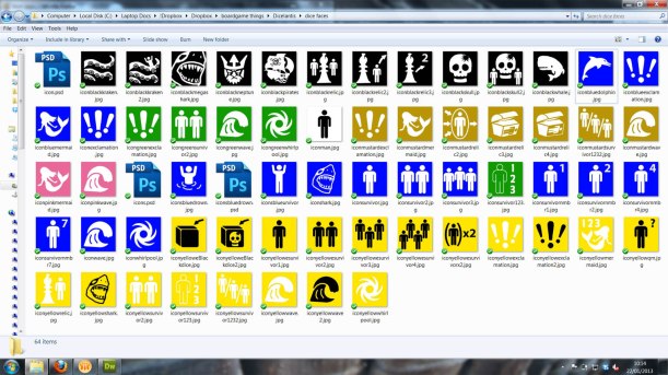
Some good feedback from Zev at the show was that treachery dice should be pain. We don’t want anyone ‘hoping to roll a Neptune’. Pain. They also need to add uncertainty to the game, in as much as vary the game end point by putting dice back in the middle. At this point in time black dice were ‘claimed’ showing a face that was originally a crystal skull and later become the face of Neptune. Unfortunately, that face could be rolled when the treachery dice was put into an opponent’s cup. Now, this was my mechanism that dated back to when the game was a set collector. Over 3 years later it was still there…for no reason at all now. That went. Down to 7 icons and a 2 Whirlpool/2 Megashark/2 Kraken face distribution on the treachery dice. That was easy.
all

Neptune wasn’t the only icon to fall by the wayside. Don’t ask me what the whale did- I honestly can’t remember. I do miss the pink mermaid dice though.

The scoring dice also needed tweaking, we thought. Rolling a 1 or a 3 was a bit too swingy and we wanted a roughly even score to encourage to inflict 2.2 points of damage rather than settle for 2 points themselves so we moved to a 1/2/2/2/3/treachery scoring dice which evened the points scores out and made the games closer to the wire in the end game.

Despite Zev liking the game, Filosofia, it seemed, were not publishing dice games that year. Nuts. We were back and enthused though! Enthused! We sent a copy up to Alan to see what his designer group thought of it.

They thought it was terrible.

Now, this is a group of Euro buffs. Dice chuckers are not their thing and they are never going to buy a game in this genre, which made their feedback absolutely priceless. We can only thank David BrainSebastian Bleasdale and Brett Gilbert for their time. The biggie: there was a massive start player advantage. With no treachery dice in the game, there is no risk and with the game ending after the last score dice is claimed the player who took the most turns was the likely winner. Obviously. See what I mean about ‘good designers’?

Let’s give every player other than the start player a black dice…OK, that’s a lot of fun. We’ve just put the fun in from the start. Players don’t need to ‘work towards the fun stage’ any more. OK, that seems good: we’ll go with that.

Then what happened was…well nothing. And at 2.5K words I think this is diary enough. Nothing happened. The end. We’ve sat on the files ever since. Sam’s a father now. I’m 40 in June. Dicelantis could sit on Google Drive for a few more years or we though we could do something with it.

So we did.


1 Comment

Equalising Investment

Happy New Year, let’s try to get a few articles up. I have a few half written that I want to get off my drive, so we shall suspend the Matt/Sam rotation as Sam is *cough* really busy at the moment.

-Matt

Catering for unequal investment

“It is sometimes said that poker is a game that can only be played for money, and certainly a game of poker in which players did not mind who won and how much would be fairly boring and pointless. It is possible, however, to play poker without money if the players care sufficiently about how many chips they win or lose.”

– John McLeod, Poker Betting and Showdown.

Grab a board game off your shelf and flip it over. There will be a  little white square in the bottom right that gives you all sorts of different metrics about the game: average duration, age suitability, number of players supported and the like. I have never seen one that gives an indication of the degree to which all players need to be equally invested in the game’s outcome in order for it to function as a game – that’s a curious thing given how important this is in determining how a game is experienced.

YGOHaving an equalised investment in the outcome of a game can simply mean playing to win- it is the most obvious reason to play a game. It need not be though. Every player could be equally invested, for instance, in:

  • Learning how to play
  • Exploring the limits of the game
  • Having the most entertaining time within the game’s framework
  • Attempting to break the game (this is what playtesters are all about, for example)

Aside: one thing that consistently depresses me about the stats of this blog is how many page views the Horror of Card Games post has got (>4000, far more than any other single post). It was a list of stream-of-consciousness-ramblings written in despair at seeing yet another CCG thread appear on a games design forum. Our audience, it seems, likes lists.

So which games are prone to breaking down more with unequal player investment? If games are viewed as points on a scale from those that are flexible enough to support unequal player investment and still function well as a game to those that require precise levels of equalised skill or else they fall apart or snowball, consider the following:

  1. Wits and Wagers
  2. Augustus
  3. Ticket to Ride
  4. Carcassonne
  5. Settlers of Catan
  6. Monopoly
  7. Puerto Rico (the poster child for this situation)
  8. 18XX games
  9. Scrabble
  10. Container (some people love this about it. Me? Less so)

My thought is there is more to this than a simple divide between gateway and non-gateway games in terms of how well they function with unequal investment. Take, as examples, Chicago Express and American Rails. These are very similar games, American Rails acknowledges a debt to Chicago Express in it’s design. Fans of Chicago Express tend to decry the later design as being ‘too loose’, lacking the fine balance and minimalism of the predecessor. Dealt with in a purely mechanistic sense, this is entirely true. However, played with unequally invested players American Rails shines as a fun way to engage players with a taste for thinking in a competitive endeavour for 120-180 minutes (it runs slightly longer than Chicago Express, although without a good knowledge of the value of each share at the start of the game it can be ‘over’, effectively, in 15 minutes).

“What occurs to me now is that this search for a well-played game is already a radical departure from what we do, as adults, when we play games together.

Normally, the only common intention that we have been able to establish with each other is that we have each wanted to win. Though we have been playing games together, the only effort in which we are usually united, the only accomplishment that we have all been able to validate, is winning.

It is clear to me, now, that the result of such a union is separation, always separation.”

-Bernard De Koven. The Well-played Game: a Player’s Philosophy

Adults coming together to play a game arrive as a unified group all trying to win and leave separated as winners and losers? This must assume equalised investment: a unification of investment in the outcome is paramount for the game to stand any chance of being viewed as well played by all players.

“When people talk about group-dependent games, I think they mean ones that need a particular type of player investment to become ‘well-played’. Players that can’t or don’t want to invest in that way often blame the game as a result, but players who can often find this kind of game their favourite.”

-qwertymartin, QWERTYUIOP: “Playing to win or playing to play?” 

scale 2Whilst I might take issue with the assumption that ‘wanting to win’ is the driver that unites adults in games, I think there is a scale here and that games like Carcassonne, Witches’ Brew and even American Rails are more likely to leave players of unequal investment in the outcome satisfied. Importantly,  I don’t think any less of them as a result. A game’s ‘flexibility’ in engaging players who care AND those who don’t is a metric that should be sung from the roof tops! Surely it could be included somewhere on the box, and that gives rise to a dilemma: how could you use iconography to depict it on a box?

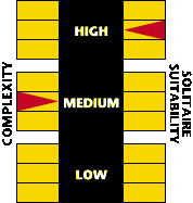
GMT Games use scales of complexity and  solitaire suitability (something I have always felt to be binary, rather than scalar) on the back of their boxes. Having a similar 1-9 scale to investment required would forewarn players of the type of game they were getting into and inform purchases. A GMT style scale might be fine at the heavier end of the market, but how do you communicate the same concept to the family market? Is it even relevant to them?


10 Comments

Guest Post: Game Themes (mostly Trains)

IzzychuGuest Post#1: IzzyChu

Hello! Welcome to the first in what we hope will be a series of guest post here at Example of Play (put another way,  Sam and I need some time to get material together so in the meantime: ringers) .  First up is IzzyChu with a perspective on theme from a teenager’s point of view. Given that the majority of games blogs are the opinions of doughy dudes in their mid-twenties to post-middle thirties, like us, I thought that a change in perspective would be interesting.  -Matt

Game themes*

*and why I won’t leap to play your game about historic Sweden.

Is it just me, or do so many game designers pick the dullest, most uninteresting themes? Take literally every train game for example. Now, I’m sure some people enjoy ticking off a Krauss-Maffei ML-4000 Diesel-Hydraulic when they go to Ohio, but I don’t. In fact, my experiences on trains are pretty boring. So I automatically associate the train game with being bored because I’m always bored on trains.

Trains4

My experiences with trainsTrains2

The thing is, you can ask Matt to play pretty much any game, but he still doesn’t find train games very fun. I don’t play them at all. Pretty much. Okay, there’s some exceptions. For example TRAINS is OK. It’s just a card game though, and I think it would still be more fun if it had a more interesting theme.   String railway, too. Again, would be more fun if under a different theme.

I’m not saying that everyone should hate train games and you’re wrong if you don’t, my point is why create a game about something that general people don’t find very interesting? Because of this, only gamers that actually liked trains would play big train games like Ticket to Ride,which isn’t as big an audience as it could have if it Trains3was about something that the general gamers enjoyed too. This is why Agricola isn’t played as much as it should be. It’s better than it sounds! A lot better….
“Hey, want to play a game about medieval farming? It’s great fun!” Doesn’t sound very exciting, does it? So, what about games with good themes? Which stand out as unique?

Sushi Go! – Sushi restaurant!

Botswana– Plastic animals! Yay! Collect all the lions!

R- Eco- Recycling?!! Certainly unique, if not exciting.

Tenakee– Totem pole building! Yeah!

Now, I’ve been thinking about creating a game for a while. If I did, it would have an interesting theme, because I don’t like, Trains, historic Sweden, ancient postal services, or planning shipping routes. Sorry. And so, I present…

Alpacalypse

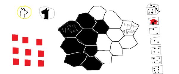
-the extremely well researched board game with top quality illustrations and made with extremely high-tech graphical software (totally not MS Paint) Alpaca1 1 person plays the light alpaca, 1 plays the dark alpaca. Each turn you roll the dice. The 2, 3, 4, 5 and 6 are movement numbers- how many hexes you can move your counter through. The last hex you walk on you flip over. If it was dark alpaca territory, flip it to light alpaca territory or vice versa. The House icon means that you put a red house token on the tile you’re standing on. The tile now cannot be flipped. Once you have 10/16 tiles in your colour, you win immediately! Would you rather play Alpacalypse or explore historic Sweden? Honestly?


6 Comments

The Shape of Games

Games, much like stories, often follow a set plot. How the game unfolds or how it builds momentum as it progresses can turn a “yeah-it’s-kinda-fun-I-think” game into a polished, table-top hero. This can be wonderfully illustrated by borrowing one of Kurt Vonnegut’s lectures “The Shapes of Stories”.

Kurt Vonnegut

Kurt Vonnegut (1922-2007) was an American writer and one of my own personal heroes. An early science fiction writer, he wrote with dark humor, satire and intellectualism and famously lectured on writing. His work is often characterized by wild leaps of imagination, mixed with humanism and cynicism. I think that his best stuff came from his uncanny ability to look at something from an exciting, almost childlike point of view. Even simple topics like going to the postoffice were investigated by a mix of unashamed wonder and “what if’s”.

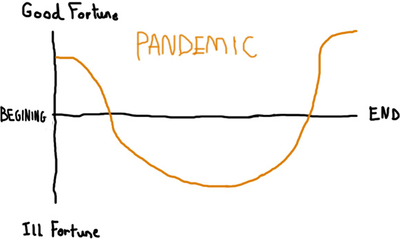
Vonnegut gave a talk on “The Shape of Stories” which broke down story plots into simple curved graphs. Good fortune and happiness is at the top of the Y-axis, with ill fortune and misery at the bottom. The X-axis is made up of the “B.E.” scale; the Beginning, and the End. The first of his story examples is “Man in hole”.

Man in hole

“You will see this story over and over again. People love it, and it is not copyrighted. The story is ‘Man in Hole,’ but the story needn’t be about a man or a hole. It’s: somebody gets into trouble, gets out of it again.” – Kurt Vonnegut on the shapes of stories.

In summary: A man starts on a nice high – everything is ok. Then he falls into a hole and plunges into ill fortune “Oh no!” he shouts from his tiny hole in the ground. “Everything is terrible!”-this is the lowest point of the story. Then he saves himself and climbs out, ending on a point that is better than when he started.

pandemic

The Shape of Pandemic

Pandemic, the disease-prevention game, is a stellar example of this “Man in hole” plot. The players, acting together start in a pretty good place – they’ve got a fancy new player-role to explore, they are armed with some Epidemic gameplay cards – sure there are a few outbreaks of disease here and there – but overall, the players find themselves in a pretty good condition. After a few turns the diseases build up. More people get sick and Buenos Aires gets infected 3 turns in a row. Then the cubes start mounting into high towers. Then someone forgets to work on Baghdad and the “Blue Cube disease” outbreaks to Moscow, Baghdad, Algier and Kairo. Another outbreak hits in Peking which overflows to Shanghai. People are dying, infection is spreading. The outbreak counter is high and there are only 6 black cubes left. At this point, the players find themselves, much like the man who has fallen into the hole, at the lowest point of the story. If it gets any worse, it’s game over. Then, just as all hope is lost, the medic solves Jakarta’s “Orange cube Disease” and in 3 turns manages to pass the Johannesburg card to the Scientist who discovers the last cure at the final moment – the players win and the man climbs out of the hole. Everyone feels even better than when they started and the Shape of the Game is completed.

dominion2

Deck Builders

Dominion on the other hand represents a long, smooth incline, each new card your buy and put into your deck building engine pushes you ever further into “good fortune”. Here the very first turn represents your lowest point – it’s all up from here, your hand on turn 1 comprises of a bit of gold and a few “for the hell of it” victory point cards that clog everything up. There comes a point in dominion, and many other deck builders where your engine is at it’s “most efficient” within the constrains of the time frame. Once the game has reached this point, most turns consist of buying Provinces until they run out, shown by a small plateau at the end of the Shape.

werewolves

Games with two teams

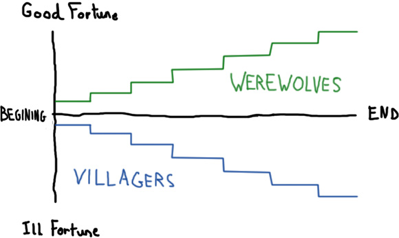
We can give a shape to Werewolf (Mafia, The Resistance etc.) while taking a different view of it. Each opposing team will have a different “unfolding” to their game. In the Shape here, we see it is a very bad match for the villagers and they fail at catching any werewolves. Whereas the werewolves are having the opposite, matching game. Each step here represents a villager being eaten or burned, the villagers sinking lower and lower with each terrible incident. The werewolves on the other hand are getting more and more good fortune as they evade capture. The starting point for the villagers is slightly below the norm also because even from turn 1 the bleak prospect of “You are going to die” is not very comforting for them.

It’s not just Winning and Losing

The simple possibility of “Winning” and “Losing” a game is not an excuse to have the shape of your game finish on a high or a low, after all, many games that you can win don’t leave you with a Good Fortune style outlook. I have played many games where although I have technically ‘won’, the scowl that my wife gives me afterwards does not leave me with a positive vibe. In fact I’m sure that most of us have at least one game that we will simply not play because it makes us feel like shit, Battle Star Galactica – I’m looking at you… (Edit: My copy of Citadels went from a fight to eBay in 24 hours – Matt)

To Sum

Like stories, games have plots or “Shapes”. Games don’t need to start in a certain place, but as long as they have variation in the shape, and end on a high they will be a rewarding experience. Certain styles of games follow certain plots and these Shapes can be a very useful tool in understanding how a game “unfolds”, a key property of your game.

bibliossummonerwars7wonders

jenga


3 Comments

Social Footprints of Games

Recently, there has a brisk exchange of views in the ExPlay chat box vHangout. Offices? They are SO last year. The topic of this verbal sparring is the card game Sushi Go!

Both Sam and I think it is a very good, light, game. And that where the problem starts.

You see, when Sam reviewed the game for Purple Pawn, I switched off completely when I read the comparison with 7 Wonders. It’s a game like 7 Wonders…? I don’t care about it. 7 Wonders is a good game, but not one that is worth me owning because having borrowed the local shop’s copy and played it a couple of times my wife remarked that it was too much like work and none of my other groups like the experience of playing it. If I have a chance to play a 60 minute game, it would not be 7 Wonders.  7 Wonders has the wrong ‘social footprint‘ for any of the groups I play with- I shall explain…

20131113_170222 20131113_170047

On the left  is where I keep Sushi Go! and on the right  is where I don’t keep 7 Wonders. 

Sushi Go! is a card drafting game. Players are dealt an opening hand of cards from which they select one, reveal it, then pass the rest to the player on their left. this continues until all cards have been selected. There cards are fairly straightforward in that they score points either n their own or in combination with others, or are chopsticks that allow you forgo a selection in the current pack in exchange for two selections in a later pack. It is light, small, fast-playing, easy to explain and a joy to play. Essentially it sharing the same core engine with 7 Wonders, but none of the other characteristics.

A game is more than a collection of mechanisms

This leads me to something that I’ve been meaning to talk about for a while: the social footprint of games. This article about RPGs is interesting because I think the graphical way of showing the reduction of the potential to get a game played in a social situation is great. Briefly, the more exclusionary layers you add to a game, the smaller the potential number of plays will be. A game might really need a 6 hour play time to get across what you want to achieve with the design, but that layer of design will cost you players and plays.

Sushi Go! Has a different social footprint to 7 Wonders. The situations in which the two games get to the table are different, and therefore a straight comparison in a review is not useful to me. In fact, it’s an actively destructive thing to do.  Sam disagreed and escalated matters by contacting the designer, Phil Walker-Harding:

Hey Sam,
No problem about the delay, thanks for playing!
Yes, “7 Wonders light” was definitely a conscious aim of mine in designing Sushi Go. Although really I was trying to bring the raw mechanism of pass-and-draft to the fore, without worrying about all the little subsystems like in 7 Wonders, so maybe that’s why your friend is resisting the comparison!
Anyway, thanks again for supporting my games!
All the best,
Phil

All of which is fine, but consider this:

rocket 280px-Ford_Focus_2004

On the left  is an MRV Rocket, on the right is a Mark 1 Ford Focus. They both have the same engine. I’m going to give you a moment to let the raw power of that analogy sink in…

I’m not arguing that Sushi Go! owes something to 7 Wonders. It does. However, when you review a game or pitch it I strongly feel that positioning it in the same social context as it’s real competitors is important. For the target audience of Sushi Go! there is no decision as to whether you buy/play it or 7 Wonders, it’s whether or not it gets played over Tenakee, Botswana or R-Eco. For that matter, Fairie Tale is probably the most analogous game to Sushi Go! and would have a wider appeal were it not for the fact that graphic design makes the game frustrating for non-gamers to grasp. Hopefully the new Z-Man edition will help this.

So, designers, fight the right enemies. Your game is clamouring for a time slot, not a  mechanism slot. I can safely say the number of times I’ve said:

“Right- we should fit a blind bidding game into this session”

is vastly less than the number of times I’ve said:

“Right- what 20 minute game can we fit in?”

Equally, reviewers, take a a broad spectrum approach. There are many factors that influence a purchase and working out the fit of a game to potential players has a lot of value.

In summary: Don’t just be aware of the competition, be aware of the playing field too.


1 Comment

What social interactions should be in your boardgame?

cursor_78bf47_708169

Don’t worry, we all did it too…

Arguably, the main reason to play a boardgame is human interactions. Be them with other real people or intrinsically within the mind of the solo player (a struggle between the mediating ego and your self-critical super-ego). Without humans involved, boardgames disintegrate into lifeless bits of plastic and round cardboard circles. Much in the same way: physical challenges aren’t fun, but the feeling of triumph when you conquer a 20 mile run can be hugely rewarding. The magic ingredient is “people” – As soon as there are other players involved in the game you are playing (outside of a single player game) social interaction becomes both inescapable and potent. Raph Koster’s book “a theory of fun”, has superb information here. Some of the key social forms that can be displayed in a game are:

  • Schadenfreude, “Hah! I won and you lost, this means you are inferior to me.” A drunken, gloating feeling you get when a rival fails at something – a put down.
  • Fieor, “YEAH!” *fist pump*. The expression of triumph when you have achieved a significant task. This is can be thought of as expressing to others that you are involved with success and as such, valuable.
  • Naches, “You’ve done well young padawan…” The feeling you get when someone you mentor succeeds. This is a clear feedback mechanism for continuing the tutor / learner relationship within your social frame.
  • Kvell, “You didn’t really have a chance, I was taught by the world champion.” The emotion you feel when bragging about someone you mentor. Signalling that you are valued in your socialframe and ear marked for special treatment.
  • Belongingness, “You’re like me!” said to be one of the most basic psychological needs, the tendency of humans to be part of a group. I hope you enjoyed the free lemonade at our cursor disco – you are one of us now.
  • Out-group Derogation, “You’re not on my side.” Where an out-group (eg: “The opponents”) is perceived as being threatening to your own kind. Also known as “No I don’t believe anything you say because I think you are a Werewolf”

We can see that Schadenfreude and Fieor will be easily on display on any table top, but how can Naches get involved? Gateway games perhaps? Family games? And perhaps we could find Kvell in a high level competitive CCG game? Perhaps the traditional “rules lawyers” gamer type: the ones that don’t let anyone else see the rule book and casually forget to tell people those crucial special-case rules, perhaps they exhibit constructs displaying Kvell. In a full competitive game, Belongingness would creep up in a ‘King-maker’ situation; where a single player (although not a winner herself) would be able to choose the winner. Simply put: she will choose who is most firmly in her own group.

The constant manoeuvring for social status that we all engage in day to day life is itself a cognitive exercise and as such: a game. Playing in a neutral and player-created gamespace these social rules can be both polarised and subverted. It is people that play your game, and it is the people that you want to tempt, exhilarate and entertain (however you game sees fit to do that) with your game. There is often far more going on in a players head than just the rules.


3 Comments

Language (in)dependent games

“…but if I wanna read, I take a book, not a boardgame”

– Bernd Eisenstein, IronGames

It’s a great quote isn’t it?

Yet when you look at the top-rated BGG games it becomes harder to rationalise. Twilight Struggle; Agricola and Android: Netrunner all have fairly heavy language dependency, whereas PowerGrid; Caylus; Tigris and Euphates on the other hand have components that are free of text. Language independence is quite clearly good for a publisher in that multi-lingual publications benefit from better economies of scale. Does it matter from a designer’s point of view though?

What is a language independent game?

Language independent games can be defined as those where the physical components do not require that the players understand any one language.

From Eisenstein’s perspective it does because he is both publisher and designer. Then again, so is Tony Boydell and I see Snowdonia is doing very well in a variety of languages. A thornier example would be GOSU and GOSU:Tactics which is a re-implementation of the same design only this time without language dependency from a smaller publisher.

As a designer, do you make a language dependent game or not?

You know what this means...

You know what this means…

A lot of this harks back to knowing your audience and the horror of card games, and it certainly helps to know if you are designing for a publisher who is happy to publish the right game in different languages if there is a valid design reason for doing so; or for a small press/self-published release. From a design process point of view I think the decision to go with a language independent design should be made earlier rather than later. Depending on what and how you approach the design of a game, the components may or may not be an early design consideration. The key question in the process is:

How much information do I need to give to the player about how to use this component?

If the information you need to impact is complicated- you are going to need to use a complicated language. If the information is simple enough a design might be able to use a simple and intuitive icon-based language to communicate how a component is used.

The language of components

Language independent boards are reasonably commonplace in that iconography and layout can be explained in the rules with a single diagram. Boards, as components, are large and can use spatial positioning to avoid complicated language. Player tableaus might also achieve this if they are not acting as an aid memoir too, or they risk being bewildering complexity (Bora Bora, I’m looking at you). Cards are smaller still and allow information to be hidden from other players, but that information can still be relatively complicated (Magic: the Gathering, Twilight Struggle). Cards are, then, the most common component in which we see language dependence (Agricola, for example, where the cards are the only dependent component amongst many).

Language dependence influences your design

You can’t just ‘take the language out’ of a game. Simplifying the component instructions might be possible but it doing so, the component interactions are also simplified. And that, from bitter experience, can make a game boring.

If you must include cards in your design (and regular readers by now must be starting to get the impression that I am really starting to hate designing card games- they are absolutely correct in this) for reasons of simplicity for print-and-play or to include hidden information and instruction from other players, try to make that information as simple as possible. You don’t have to actually do this, just mentally consider what is achievable or what could be done if the language usage was reduced to a level where iconography would suffice. Again, this has to happen early in the process or you risk getting sent back to square one.

A case for using both icons and language on cards

A friend of mine describes some games as ‘nits games’. Nits are a colloquial term for head lice (or their eggs) in the UK: an obligate human blood-feeding parasite that spread by head-to-head contact, usually by school children. ‘Nits Games’ are those where the players crowd around the central play space to read cards that have been revealed or dealt that contain words or symbols too small to be read by the players without craning in to see them. ‘Catchy’ isn’t it?

Anything that reduces comprehension time it usually a good thing. If several words may be saved by the use of a symbol- it’s probably worth doing. This is particularly the case when considering demonstrations of your game. If the first things the players have to do in a demonstration is read and understand a lot of card text, the demonstrator is going to lose tempo and excitement will wane until the gameplay proper can begin.

Consider the meaning the component needs to convey and do it quickly.

Cartographers understand

Warning: algae

Warning: algae

Whilst looking for a way to approach some icons I needed for a print-and-play micro-game recently I came across this article that addresses good design in map symbols. A lot of the points made are transferable to game design symbols:

  • Make it easy to recognise Provide a player aid by all means, but referral slows play and it should  be a learning aid more than an essential component.
  • Keep it closed in form Using a closed form helps focus on the symbol. For example, a circle is a closed form that focuses the viewer’s eye on itself. A star is an open form that makes the viewer’s eye want to move out.
  • Keep designs consistent Sets of symbols are easier to mentally group and learn.
  • Make it reducible Detail will be lost at small scales. Don’t agonise over a design that is not fit for purpose at the scale it will be used at. Reduce early in the process.
  • Pander to perception Viewers perceive symbols directed up and right as positive and down and left as negative. Also green symbols are generally positive, whilst red are negative.
  • Use negative space Negative space makes symbols really stand out from a background. Consider plain filled or entirely negative symbols on textured backgrounds.
  • Don’t lose the symbol Consider blocking out sections of board or card art to lead the viewer’s eye.

Ease of recognition is obviously key: recognition aids memory. Triggering memory is good for games design as is keeps the players in ‘flow’- the game isn’t disrupted to consult the rules. This is the criticism leveled at Race for the Galaxy (the poster-child, for some, in over-reliance on symbols) where the symbols taken in isolation are well designed but rather similar when viewed next to each other. I find The Phantom League is guilty of this too.

To Sum

Consider the information that needs to be communicated to the players by the game, between the players and consider it early in the design process. Keep in mind the audience you want for the game and design the components as simply as they can be in order to complete the design you want.


3 Comments

How to write an Elevator Pitch

How to write an Elevator Pitch

Deep breath now...

Deep breath now…

The pitch is the interface between the hobby and the profession

Convention season is on us and you’ve just bumped into that industry professional you have always wanted to meet. You walk up to him with your game in your backpack and a big goofy smile. You exchange pleasantries and then he asks what’s in your backpack. You open your mouth, and then stop. Where do you start? There’s just so much to say! Then, as you try to scrabble to organize your thoughts, he is called off and on his way. You are sure that if you were better organized he would have been very interested in your concept. To break out of the hobby and into the semi-professional, your games each need to be equipped with a pitch.

Telling me about your game is boring.

Sorry to say, but if you just “told him” about your game ad-lib, chances are it will be a hodgepodge, scattergun approach that will take too long because you are so excited and unprepared. He may be very indifferent, lose interest, of even stop you halfway through your explanation. He may think that the next 20 minutes he will need to listen about your game before I can even decide if he likes it or not. These 20 minutes are lost. You would do better to get to the heart of the information as fast as you can. Ideally you would have a snapshot or some kind of movie trailer (with portable projector) for your game to have the good stuff condensed down. This want of a précis (indicative abstract) is exactly the same reason why we look at the back of a box before buying it – to get to the point.

What is the goal of a ‘pitch’?

There are many evolutions and vehicles of a “pitch”; mission statements, public strategy, sales presentations, “Barking”, poster events, executive summaries, etc x 1000, but the one that you need to concentrate on as a boardgame designer is the “Elevator Pitch”. The goal of this is to tell someone enough about your game for them to make a judgement in the shortest amount of time possible. “Yes I will playtest your game, yes I will listen to your full pitch, yes I do think this is a decent concept”, is what you want to hear after a pitch like this. Remember, that if the answer is “no thanks, that is not interesting” or similar, then you will be saving time for yourself and your subject – this is a very good thing and leaves you with more time to speak to others that will have better inclination towards you.

You get one chance, so make it good.

“What if they say No, but I didn’t really have time to get to the best bits?”, then unfortunately, your pitch was bad. This kind of pitch is a concise verbal presentation of your idea that acts to summarize your proposition. The long and the short of this, means “Put the good bits first”, aka “get to the point”.

The anatomy of an Elevator Pitch

  1. You have thirty seconds to say it all. Traditionally this was the time you had to speak to someone in an elevator ride up to their floor.
  2. Use clear language. No fancy words, forgo all abbreviations and assume no prior knowledge of your game. Concise.
  3. Use powerful and visual words. It is ok for this to sound a little bit “salesy”, it needs to demand attention and leave the listener with a strong and visceral image.
  4. Tell a story. Why does this game exist? What are the steps that brought you here?
  5. Practice. Yes in front of the mirror. Yes you have to know it off the top of your head. Yes you have to practice in front of friends.

How do you create an Elevator Pitch?

Step 1. Write everything down. Write down a few different ways of explaining your game. Don’t edit yourself at all; just start collecting your ideas. Put in as much long-form, blabbery, stream-of-consciousness stuff as you can here; write it all down in all the ways you can think of. Why does this game exist? How did you make it? What was your goal in making this game? What are your hopes for this game?

Step 2. Leave it for 24 hours. For at least one day, leave all of this information and don’t touch it. You will come back tomorrow with a fresh look on everything. This is ironically one of the most important steps, do not negate this as it will give you an exceptional look into your own game.

Step 3. Revisit and highlight the best stuff. With a highlighter, find the parts that really stand out to you (remember to keep the above list in mind here)

Step 4. Bring it together. This is your chance to start writing the script for your main pitch, using your fresh eyes and your highlighted stuff; you will start drafting the pitch and connecting the best pieces together.

Step 5. Success and practice. Read it aloud to a friend or family member. Read it again to a mirror, if you have the technology and inclination, read it into a Dictaphone or record yourself speaking, this will highlight some very important weaknesses, not limited to the fact that you do not sound anything like James Bond even though you think you do (L).

To Sum:

Write it all and condense it down to 30 seconds. So when someone asks you “Tell me about your game”, you will be properly equipped and prepared.


5 Comments

Is your game going to waste my time?

The importance of designing a game for all the players, not just the one currently moving cardboard around.

My time is precious. I have a wife, a child and a dog. I play games one night a week with my gaming group and occasionally at weekends. Other than that it’s the odd game of GOSU and Jambo when time permits. When I play your game I have to think it has been a worthwhile use of one of my finite evenings dedicated to heavier-than-family games. Don’t waste my time: you won’t get a second chance.

I level this comment squarely at game designers who don’t design games for all the players- just the one taking the action. Compare Chess, where the inactive player stares in fixed concentration at the board when, totally engaged; to Snakes and Ladders where the inactive players sit, eyes slowly glazing, and wait for their turn to roll the dice. You would think designers would learn from this fairly obvious example? Alas not dear reader, the concept is still with us in different forms.

happy Don’t be fooled: two of these players and bored and miserable. 

An analysis of the problem

Any game that involves ‘miss a turn’ as an actual mechanism that can befall you fails is punishing players by wasting their time*. Games that have designed-in mechanisms that waste the players’ time are among my absolute most loathed- analysis paralysis is one thing, but tedium-by-design is quite another. If your game is prone to large decision trees, then give the other players something to do, allow them to think about their moves, to consider situations on the board- anything they would deem worthwhile. If my options are limited to:

1) glaring at the on-turn player
2) piling meeples
3) checking my email

I am not engaged and not experiencing your game…and this is bad for you.

Designers need to consider the players not actively shunting cardboard or collecting blocks. In play-testing, look at the inactive players: what are they doing? Staring intently at the board in rapt concentration or drumming their fingers and looking at the next table? Time is perceived to pass more slowly if you feel that what you are doing is a waste of time. I don’t think it’s too strong to suggest that players of any game come to play it thinking they are entitled to have a good time in the process**.

People don’t still do this do they?

Modern examples of games that ignore the inactive players are rondel games. I have had games of Antike, Hamburgium and Navegador where I could have written my next three moves down on a post-it note and gone for a 15 minute walk rather than sit at the table waiting for the inevitable to happen. I have a limited number of options anyway but on someone else’s turn I can do very little at all other than sit and watch. The idea of rondels is to script, to some extent, the actions of players and there are valid to do so: it opens up a few interesting design options. However, it also limits the amount of planning possible as an inactive player.

A modern example of a disguised ‘miss your turn’ mechanism is found in Vanuatu. This is a miserable, hateful, game where the object is to be in a position where other players waste less of your time than others. This action selection game is designed so that the player interaction results in your situation where your selections are rendered meaningless and just to rub it in, leaves you in a position where it can happen again on the next turn. Who play-tested this? Sociopaths? The winner is the person who actually gets to play the game the most, rather than being rendered a spectator.

Is it just impatience?

It’s easy to write this off as the ravings of a guy with a short attention span: not so. I will, willingly, play Britannia. And it’s not the boredom that gets my goat here either, it’s the frustration that the game doesn’t keep me engaged as an inactive player. A counter example of a game that I think gets it right would be German Railways. It’s a great game that keeps you involved even if you are not acting because you have a (financial) interest in other player’s actions. It’s designed to keep players engaged when they are not shifting pieces on the board. And that’s the crux:

Each player should be playing the game- whether it is their turn or not.

This situation can be seen in reviews. Players who haven’t actually been playing a game (20 minutes of actual decision making in a two hour game) often don’t give glowing reviews of it. And who can blame them? Ensuring players feel their investment (time, not necessarily money) in your game has been well spent is incredibly important to getting them to play it twice. If their take-home message was that they would have enjoyed themselves more if they had got a chance to play rather than watch, then you have to question if they have been playing at all.

* Or worse still, more than one turn. I saw a copy of Christian Endeavor in the Museum of Childhood in Edinburgh a few years ago and that game is harsh, especially if you are unlucky enough to land on the ‘commit murder’ square.

** O’Brien, E.H., Anastasio, P.A., & Bushman, B.J. (2011) Time Crawls When You’re Not Having Fun: Feeling Entitled Makes Dull Tasks Drag On Pers. Soc. Psychol. Bull. http://psp.sagepub.com/content/early/2011/05/12/0146167211408922


6 Comments

The benefits of crappy prototypes

The worst possible prototype is an amazing looking prototype.

Ok, the intro line here is a bit of a con (after all, the worst type of prototype is no prototype at all). When I say “amazing looking” what I mean is the shiniest, most chrome filled, graphically superior prototype that looks like it has just popped out of a modern Speil de Jahr winner,  Daniel Solis‘s* design cupboard or Brett Gilbert’s* graphical mastery.

Take a look at this:

serenity layout

This is the prototype layout to one of the games Matt and I are working on; a Firefly themed game crossing a deck builder and a wargame that takes place during the Battle of Serenity Valley. The game so far looks to hold up quite well, but the point is that this is a prototype card. The background art is not mine of course, all rights to the firefly comics there. Does it look good? Well I think it does rather. Would I consider changing the layout of it as a prototype? HELL NO! I’m not going to destroy all of this hard work I have put into this beautiful card! This took far too long and looks far too fancy to change.

If you are unwilling to change it, it is not a prototype.

This damned card set us back about 4 weeks of development because I was too stubborn to change it. I thought that entertaining a change of layout (and thus: mechanics) would ruin all of this effort I put into the card, for fear of it being slightly damaged. If any part of you would “rather not” change a part of your boardgame – then you no longer have the right to call it a prototype. This is true of any resource: dice, cards, board, etc that you would prefer not to change. Even if you kind of want to keep it, but maybe you know … whatever. That is as bad; you are biased and you will tilt in your duty as a designer to be empowered to change things, you cannot call something a prototype if at ANY POINT you are committed in keeping something because of any reasons other than gameplay.

Board making guides also suck.

I was really getting into making the board for this prototype as well. I went so far as to buy some “book binders tape” JUST to flex my craft muscles and make a real four way hinged board. The board is really great now by the way. I’m really proud of it and the way it folds all nicely, I spent ages on it. Then the shrill but distant far away voice is heard:

*Hey … Sam, what do you think about the idea of not using a board anymore at all?*

W- … what do you mean, strange voice of reason?

*You secretly know that games downfall is the board, lets try using player tableaus, I’m sure that will really help the game out!*

B…but the board i- … it folds. Do you not see? It folds into FOUR sections strange voice, FOUR!! (Sam flips the board between it’s two states in the air as if he were preparing to break the ‘Rubik’s Magic’ world record)

Why a crappy prototype is better.

If you realise you have made a really crappy, rubbish, pencil based, graph paper, style prototype then there are a few points to consider:

  1. You will never feel too attached to the game to avoid changing it
  2. You will focus on the mechanics – as you are no longer bound by the prototypes transient and physical nature
  3. Some of you may actively dislike the look of the prototype – leading to a positive reinforcement or push to change it, if only because it looks so terrible!
  4. You are able to “let it go” if you or a publisher choose to retheme it

Don’t let your pride, your graphics abilities, your fondness for chipboard, your perfectionism or any other such irrelevant desire bind you to something that only exists to be changed changed and improved.

Why does this happen?

Well, in the psychoanalytic theory that Freud made popular: specialised strategies are brought into play by the unconscious mind to deny or distort reality to maintain a socially acceptable self-schema or self-image. This is some awesome-psycho-babble-science for what me and you know as a “Defence mechanism”. The thinking goes that we give insincere rationalizations (we make excuses) for things that we have created because these things have been born of our own hand, and are physical manifestations of ourselves. They are our gorgeous babies. In destroying and changing your babies, you are, arguably destroying and changing yourself, forcing us to concede that something is “wrong” with our babies, and so, ourselves.

This neatly leads on to another interesting point; a lot of designers (myself included) get upset or angry if you criticise our prototypes. If you stop for a minute and think about this, it makes no sense at all. Here you are, with 3 willing playtesters in front of you all keen to help you develop your latest prototype, Ambulance Quest. Now imagine this; they play your game to help you make it better. You say, “Hey, what did you think about the board?”, the reply is an uncomfortable “It is bad, we would prefer player tableaus” and you are sad, hurt, and a little angry. This makes NO SENSE. You asked them specifically for their opinion to help you with the design – and now you are making up reasons why they are wrong “Well, perhaps you didn’t invest enough ambu-cash into the bonus cards…”. This my friends is called Cognitive Dissonance and is prevelant when your mind is aware of two contrasting thoughts. In this case: the amount of work you put into your prototype, and the fact that if all your playtesters says its bad. This is especially the case with very shiny and over produced prototypes.

To Sum:

Save yourself time and stop yourself getting upset; make crappy prototypes.

6181885340_6094f60e03_o

Awww yeeeaah. You should see the “Wolf” cards.

*Daniel and Brett are two of the most amazingly gorgeous designers I know of, they are both really cool guys as well. I would heartily recommend checking these guys stuff out if you want to see what I think the gaming industry will look like in 2 or 3 years.